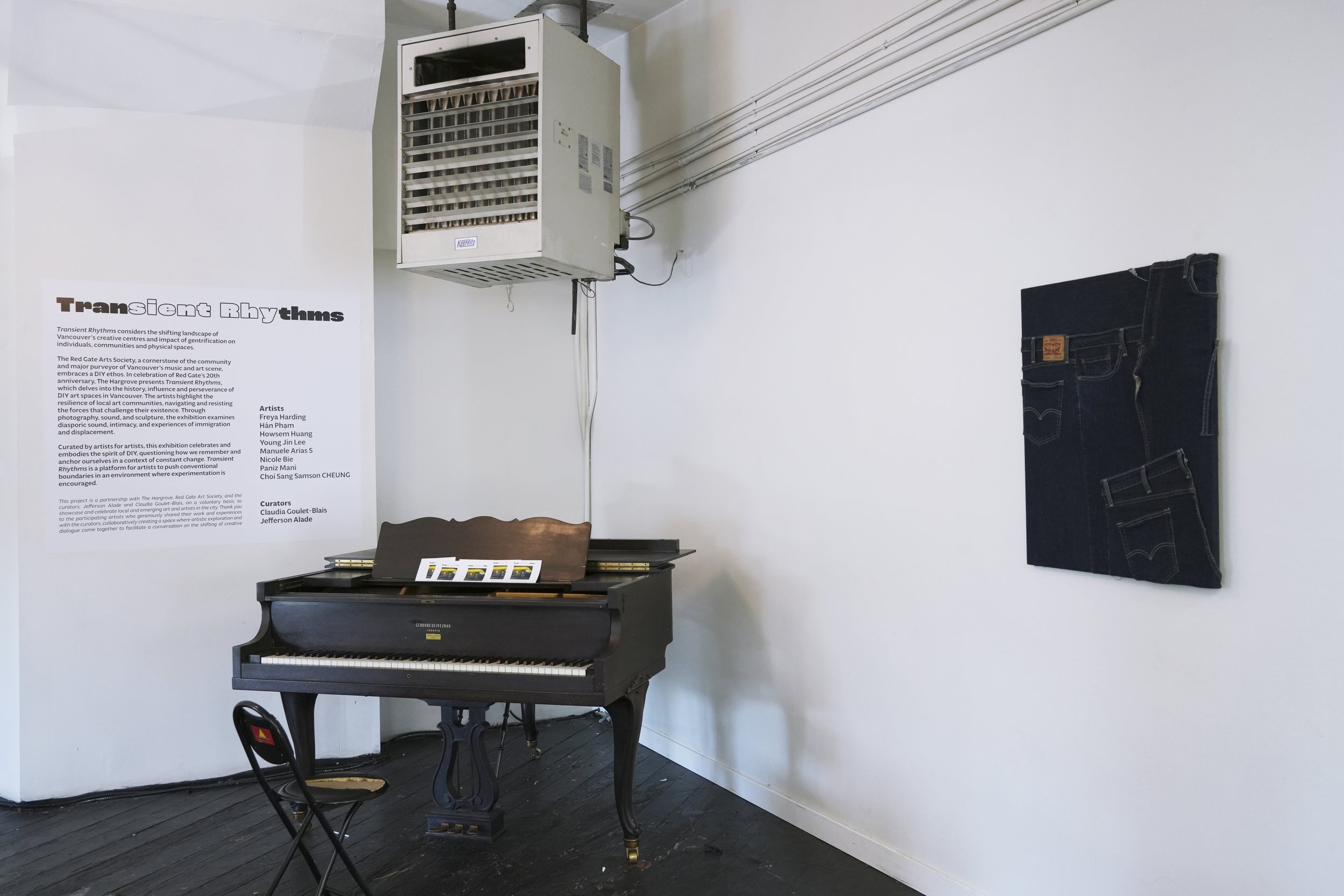
Transient Rhythms (Exhibition)
Find the digital exhibition catalogue here!
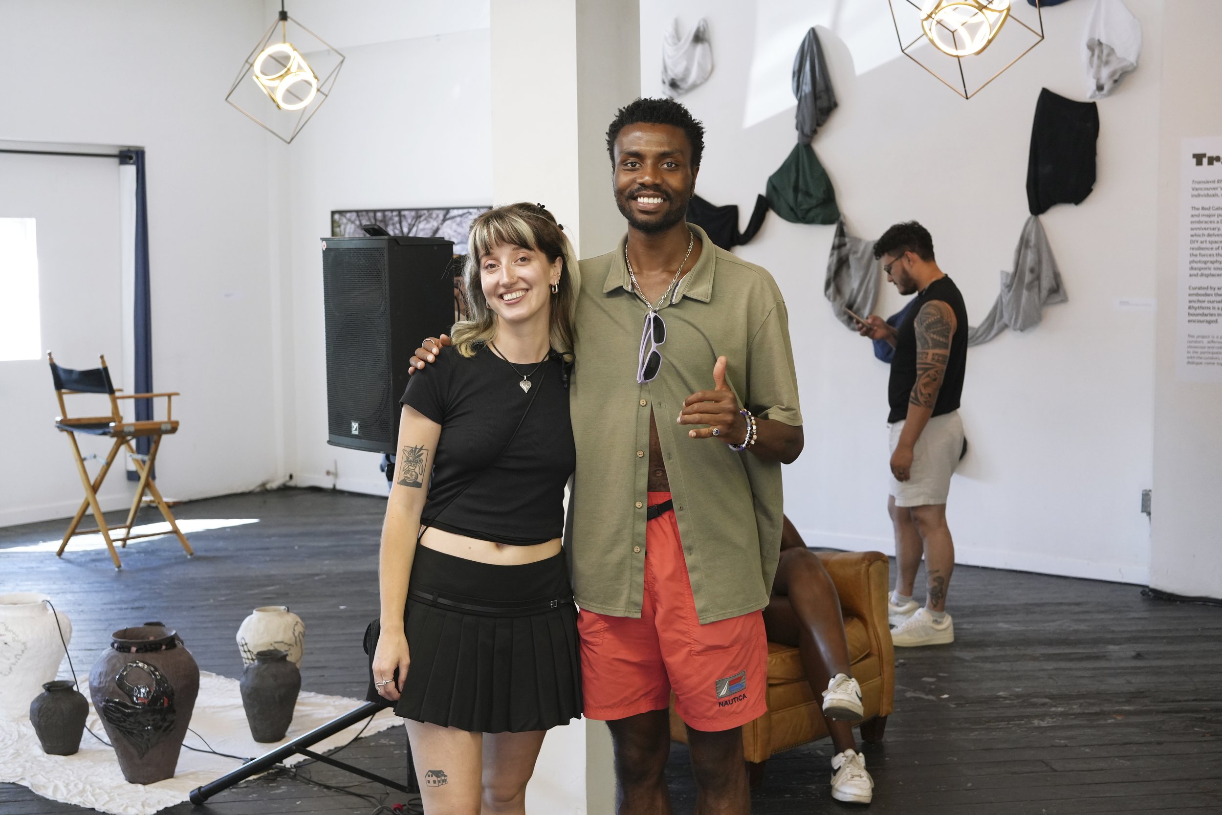
Claudia Goulet-Blais (L) Jefferson Alade (R)
On July 20th, 2024 Red Gate Arts Society turned 20. The Hargrove, a performance and recording space located on the adjacent avenue to Red Gate, joined the celebrations and asked me to curate an exhibition in their space. Coming off the back of Sound of the Sun, Vol. III (SOTS3), I was excited to continue curating in the city. However, I knew I didn’t necessarily have the expertise or experience yet in the visual arts to do so. Therefore, the first person who came to mind to help execute this project and share in the vision was fellow grad student, dear friend, artist and photographer Claudia Goulet-Blais.
Unlike for the SOTS3 where there was a set vision for the project, we had full creative control in what we wanted the exhibition to be on/about. During the research process, I stumbled upon an interview with the founder of Red Gate, Jim Carrico. This interview spurred on a lot of the theoretical basis for the exhibition. Jim talked about Red Gate’s history in the city as a DIY space and how the shifting urban centers in Vancouver push these spaces to have nowhere to go.
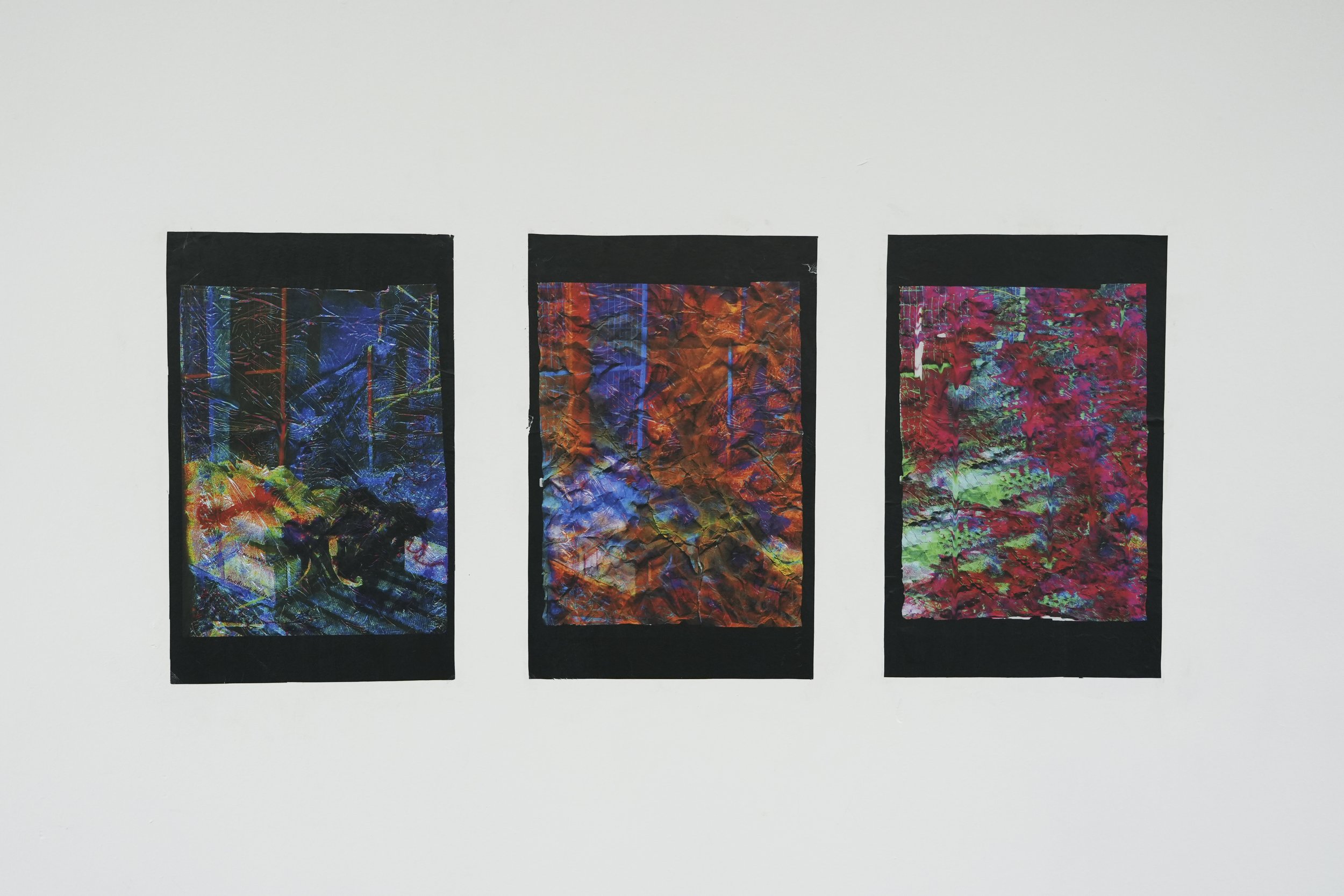
Hân Phạm
As I think of you at the end of a dream, at the end of a lifetime, 2022
Initially, we wanted the exhibition to be specifically about the idea of gentrification and lost space. However, after reflecting on the project’s scope and what we valued the most, we realized that the exhibition should be about becoming that space for artists to show their work in a DIY context. Therefore, for that single day on July 20th, 2024 we invited 8 artists to take part in the exhibition and have space to show their work.
Find out more about the artists: Nicole Bie, Choi Sang Samson CHEUNG, Freya Harding, Howsem Huang, Young Jin Lee, Paniz Mani, Hân Phạm, Manuele Arias S
It would be an understatement to say this exhibition was done at a sprinter’s pace. I felt that in the end, we ran out of time to add that 5 - 10 % of details which can distinguish an exhibition. However, I also think doing this exhibition in 6 weeks helped us learn rapidly and in a concentrated way. Talking to a friend in attendance, she mentioned that an exhibition like this done by an institution would operate over an 8-month timespan. At the core, this is what makes DIY environments so valuable to both emerging and established artists. Showing work in a relatively short timeline allows artists to quickly iterate and test out ideas in a low-stakes environment. After the show, a few artists were grateful to have shown their work in such a setting and showed interest in more of these spaces in the future.
Like in my previous post, I will break down my analysis into the curatorial and designerly considerations I made throughout this project. I will also organize the analysis with the Find, Select, Sequence framework I have been developing in my research.
Curation
Finding
The first task Claudia and I needed to engage in to put on this exhibition was finding the artists to participate. The primary ways we did this was by strategically postering/flyering, social media posts and word of mouth. For a while there both Claudia and I were getting nervous because only a few people submitted but without fail the final day was when all the submissions came in.
For postering, we tried to be strategic about where we placed them. We put ourselves in the artist’s shoes and thought of places where we would hang out. A good chunk of the posters went around Emily Carr University and Mount Pleasant. The idea behind this decision loosely acknowledges the concept of the “mere exposure effect”. The mere exposure effect (MEE) describes our tendency to develop preferences for things simply because we are familiar with them. My idea extrapolates from this concept and contends that the MEE would also enhance one’s recall of something. For example, in Mount Pleasant we made sure to hit the community center, the Western Front Gallery and Dude Chilling Park because of their proximity to each other. Let’s say someone went to the community center and only had the chance to glance at our poster because they were in a rush to make it to Western Front before they closed. Afterwards, when they leave Western Front they notice the poster again on their bulletin but don’t have time to scan the QR because they are meeting their friend at the Dude Chilling. Upon arrival at the park, they see the poster for a third time and finally recognize what it is asking and have time to engage with it.
Other places we put our posters were at galleries such as James Black Gallery, Grunt Gallery, and 818 Gallery. Stores such as Alterior Design and Rath Art Supplies and coffee shops in the Commercial Drive and Strathcona area.
One thing that was interesting to recognize from the people who submitted was that the majority of the artists who applied either went to Emily Carr University with us or knew us personally. I think this shows the power of leveraging your personal networks and how important it is as curators (and artists) to stay connected with a diverse range of people.
Selection
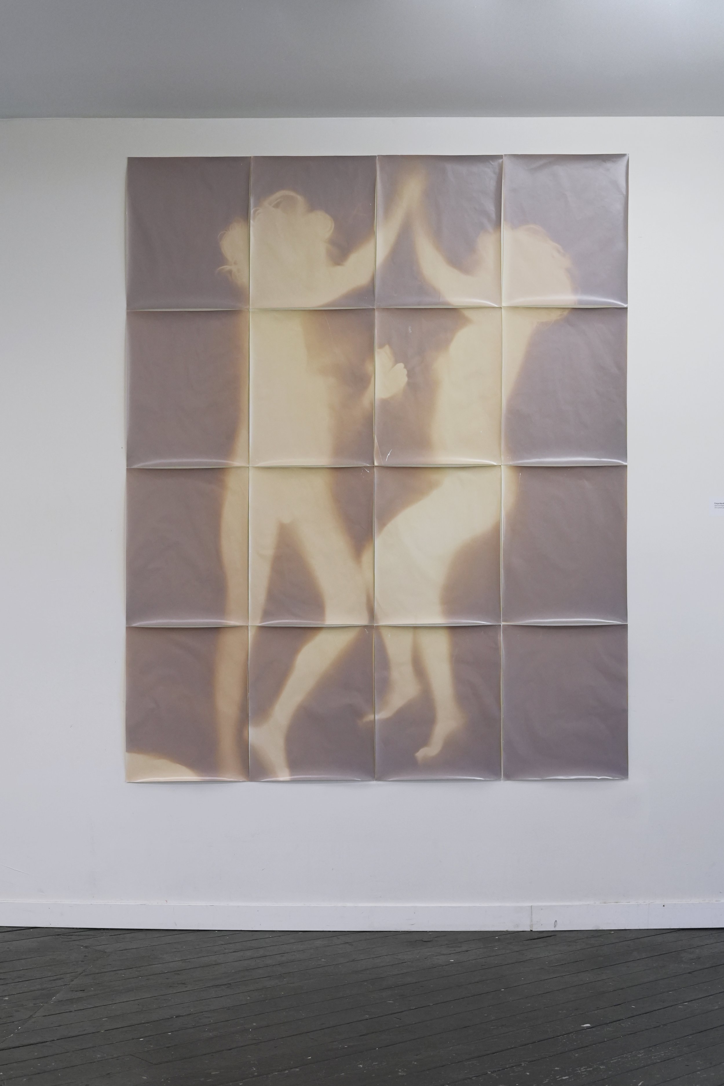
Freya Harding
Girls on Paper, 2024
In terms of how we selected the work, we were thinking along the lines of work that dealt with space— either through size, an idea or work that referenced Vancouver through material choice, subject matter or personal relationship with place.
Exhibition Design
Sequence
Avec la nature— working with the space
One of the hardest parts for me on this project was reckoning with what I was willing to compromise and what I wanted to stand firm on. Coming into the project I knew that working with a venue that is not conventionally set up for exhibiting artwork would necessitate compromises in the way we display the work here versus how we would if we were in an institutional space that had all the facilities to support an exhibition. For example, some of the walls and plinths were scuffed and were not that pristine eggshell white colour we are used to seeing in a gallery. Initially, I wasn’t the most concerned with the walls. I think I was coming at it from my designer brain— since the exhibition was on/about DIY spaces, I thought the walls being a bit messy went with the intention of the exhibition. However, I am very glad we did paint them. After understanding it from a curatorial and artistic perspective, the walls being too dirty takes the viewer’s attention away and distracts from the art. On the other hand, one of the requirements for using the space was that the grand piano in the room couldn’t be moved out. I appreciated this quirk to the space and saw it as an opportunity to lean in and accentuate the exhibition themes. Having it in the space also served to enhance the flow and spacing of the exhibition.
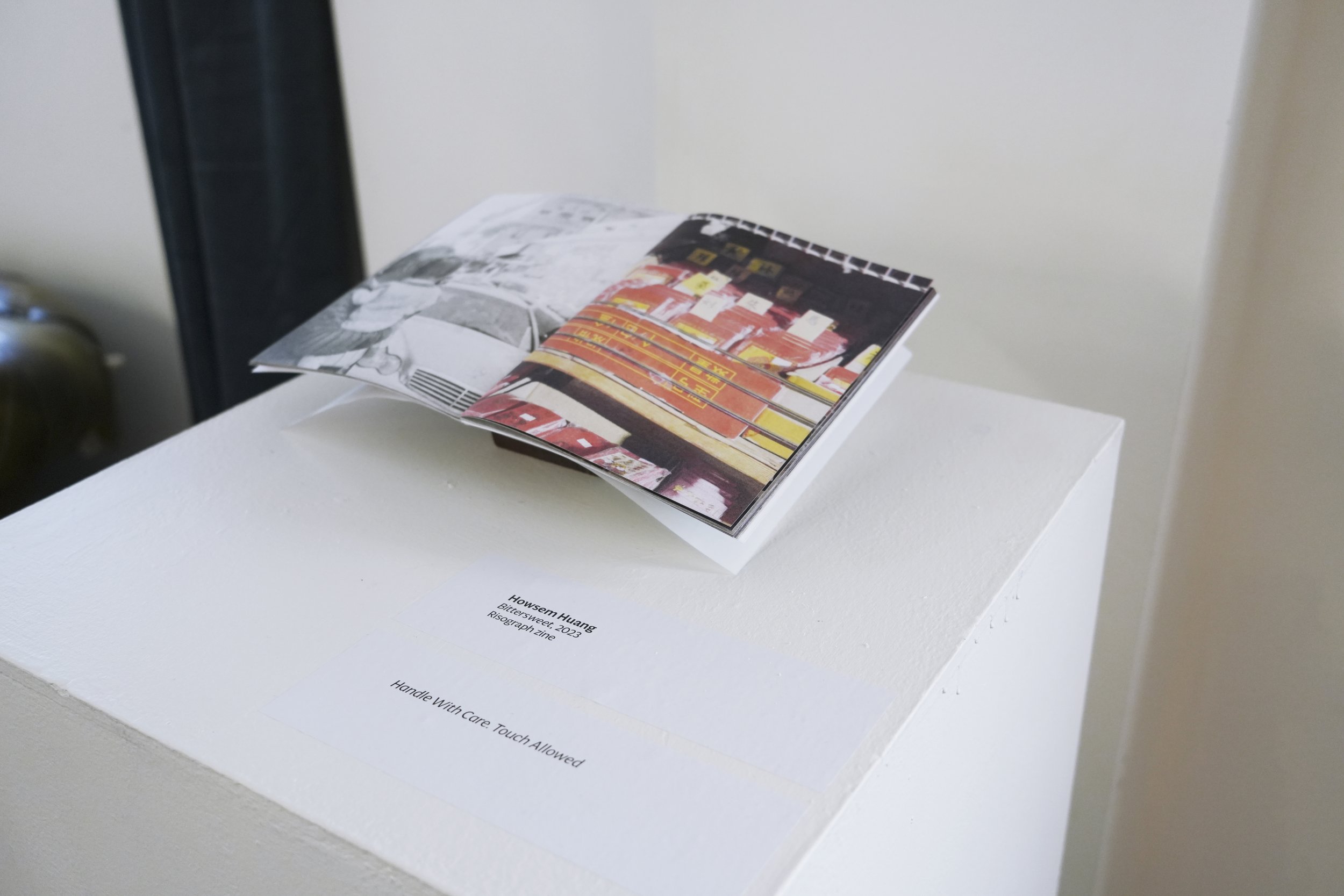
Howsem Huang
Bittersweet, 2023
Size Matters; Materials, dimensions and the practicality of the practice
One of the biggest reality checks and formative lessons I received working on this exhibition was the practical concerns of a curator. Before the exhibition, I always thought the reason why artworks listed the materials and dimensions was for artistic inquiry. However, after failing to get one of the artist’s works into the space because it was too big to fit through the door, I now understand the practical function of knowing the physicality of a work. Fortunately, the artist in question submitted two works to be featured and we were able to include the second one.
Young Jin Lee
Levi’s 514, 2023
The first work was this 40 x 40in cube that would have made a stellar centerpiece for the exhibition but when he pulled up on the installation day we quickly realized that it was too big to get inside. We brainstormed alternative solutions but every door or window that was going into The Hargrove was not compatible with the size of the work. We felt terrible because the artist looked to have pulled it from storage and had a friend bring it for him. I take full responsibility for that error and going forward I will be more conscientious of the physicality of a work in informing my decision-making process.
However, one note I would leave with artists is to think about the portability and transportation of the work you make. For the cube, I think it was part of the artistic intention to make it in a way where deconstruction was not readily available. If the reason and intention of why you are making a piece is also tied to the way it is constructed then by all means make it in whatever way you see fit. However, especially if you hope to show your work in different places around the world, it will save you a lot of stress and probably money if at the start of your project (especially for large and fragile works) to think ahead of ways your work can be deconstructed and shipped.
This learning also got me thinking about how spaces are constructed to support certain activities but more on that another day.
Installation Day
One aspect of working on this project that turned out to be surprisingly fun was the installation of the work. We set up all the works a few days before the exhibition and Claudia, myself or the artists were responsible for the installation. Nothing beats the savoury feeling of using a laser level to get a frame precisely straight and even a wall. I think for me there was a designerly aspect of figuring out what specific screws to use and a deep satisfaction in contemplating the positioning of works in space.
(L to R) Hân Phạm, Claudia Goulet-Blais, Paniz Mani, Freya Harding
Title
One way we wanted to communicate the intentions and themes of the project was through the duration of the event. We felt the name Transient Rhythms was a fitting title for the exhibition when reflecting on the shifting landscape of art and culture organizations in the city but also because of how brief the exhibition was up for. It was nice to hear the intention was received by those in attendance.
Design + Curation = New Role
In conversation
One thing I have been thinking about but don’t have an answer to yet is how should I go about defining the role I take on as a curator and designer of a project. For the last two cultural projects I worked on, utilized both skill sets in a complimentary way. Although at times it feels like the curation leads, I have seen a lot of benefit when considering both approaches in parallel or at least in a symbiotic way. Could it be that the coming together of these two roles brings forth a new position and understanding of presentation or is it okay to keep these roles separate knowing that although they work in harmony, each has its priorities when considering the presentation of work?
Thanks again for everyone who participated, attended and helped to make this exhibition a reality. Special thanks goes to Claudia, Sammy, Patrick, The Artists, The Hargrove, Red Gate Arts Society.
Find the digital exhibition catalogue here!


