
prompt.1 ~ gift

Keywords: Gift, Working Idea, Risograph, Presentation
For prompt 1 we were tasked with creating a gift for a classmate who we only just met.
Throughout this prompt, I used the term “working idea” when discussing the state of my project. By not holding any idea too tight, it gave me space to iterate and be calm when my idea inevitably evolved.
I enjoyed this prompt because not only did it force me to get to know the person I was designing for, but it also forced me to connect with my fellow cohort mate. Through our conversation and working on the prompt, I got to learn so much about her and I am grateful for the relationship we were able to form.
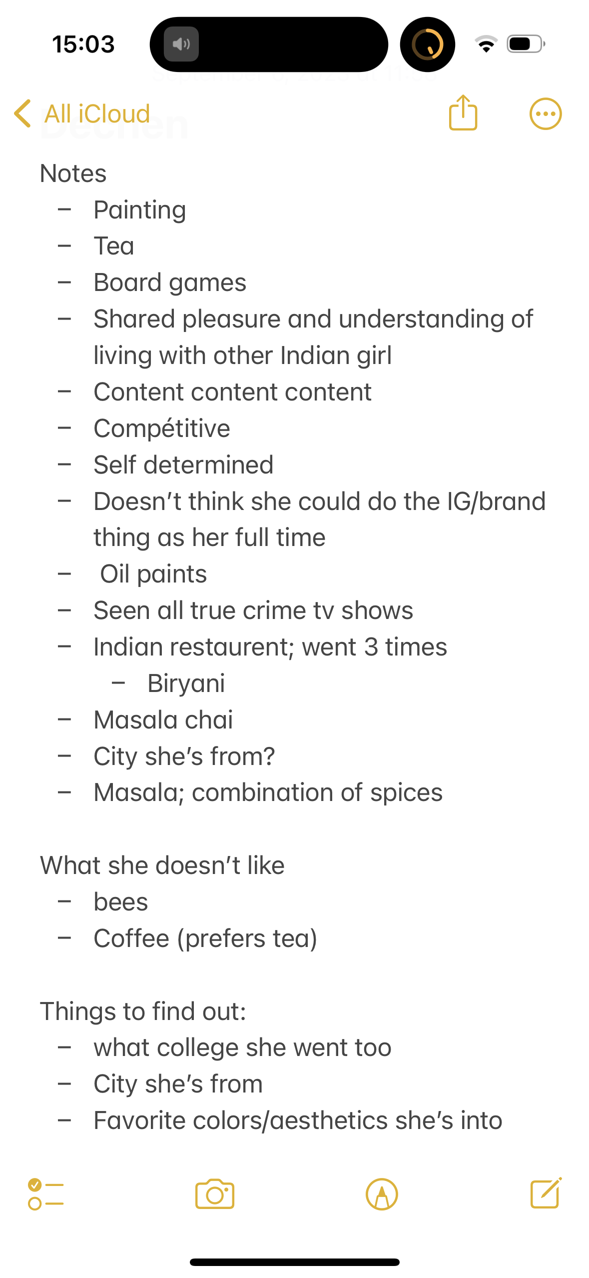
I was initially conflicted about how I wanted to approach this conversation. On the one hand, being that it is a design prompt, one should take scrupulous notes and ask the pointed questions that every designer would want to know. On the other hand, being that I was interested in getting to know Dechen as a person and making the conversation as natural as possible I opted to not take notes while we chatted. Keeping the conversation casual allowed us to have a natural flow and not feel like everything we were saying was being analyzed. I instead made mental notes on everything that she got really excited about and after, typed in my notes app everything I could remember.
Out of this list and thinking back to our conversation one of the things she was most excited about was board games. As soon as we got to the topic, the inflection in her voice rose and you could feel the enthusiasm oozing out of her.
Working Idea (v1)
The first idea I had was to do a board game night. During my first 1 on 1 with Cameron, a phrase that stuck out to me was “design behind social engagement”. Because I have a background in events, I thought it could be interesting to explore what Cameron said and put on an event. Alongside designing the event, which could act as a catalyst to build community within the class, I was also considering making a flyer. This would give the event a visual identity but also as a physical artifact that Dechen could keep to reify the experience. However, after tossing the idea around with a few peers and mulling it over I opted against doing an event. A board game night could have worked with this prompt and is something I would want to still do but I didn’t think proposing an event within a class setting was the right way to go about it.
Working Idea (v2)
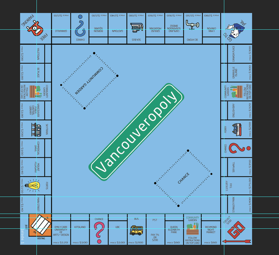
The second idea I had was to remake the game of Monopoly. I wanted to keep the focus on board games because this was what Dechen was most excited about. I chose Monopoly as the game because Dechen seemed generally interested in all types of board games and Monopoly is a game I know well.
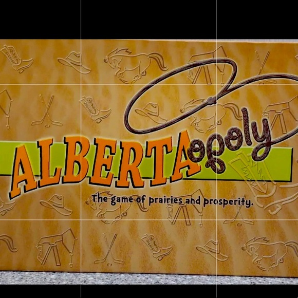
I also liked the idea of Monopoly because I remember my family having Albertaopoly when I was younger. Albertaopoly is Monopoly but with contextual elements from Alberta. Looking back, that game was also interesting because it helped position me as an Albertan by seeing all the places I have been to or wanted to go to on a physical board. Therefore, since Deechen is new to Vancouver I thought it could be an opportunity for me to make Vancouveropoly. Beyond her love of board games, by including places around Vancouver, I hope to be able to help her situate herself in this new city.
Working Idea (v3)
Although I wanted to realize a playable version of Vancouveroploy (with player pieces specific to Deechen’s interests and cards that reflected the Vancouver milieux and ethos) I had to trim my idea and focus on only making the board. The reason why I initially wanted to produce a full game is because of my appreciation when things are aesthetically pleasing (form) but also serve a function. However, after reflecting on what it would take to make the full game, I came to the conclusion that with the time I had left, it was a choice between making a mediocre full game or a great board.
In the past, I had a habit of underestimating how long things take. One of my hopes for coming to Emily Carr and doing my Masters of Design is to help me refine my ideas and the execution of my projects. Therefore, I see my decision to make just the board as a testament to me learning how to better assess my time as well as a commitment to producing high-quality refined work.
One process I wanted to experiment with for this prompt was utilizing the risograph. I only learned about the risograph when I arrived at Emily Carr and I was captivated by its aesthetic and accessibility. Through learning about the risograph and the considerations that are involved with the number of colors you can use, a lot of the ways I was thinking about how I wanted to make the board surrounded the technical constraints of the risograph.
For example, in my design of the board, I had the base color, the color of the logo, the colors of the properties and the color of the icons.
However, for the risograph at school, you can only use a maximum of two colors on a print per day and my design had a minimum of 4 colors (not including the icons or properties).
Although at times it was challenging needing to work around the technical constraints of the risograph, I ultimately found the exercise helpful as it made me think about creative ways I could change my design for it to be compatible with the risograph printing.
One of the most colorful things on a monopoly board is the color of the properties. Since the risograph could only do two colors a day and I only had one day to work with it, it occurred to me that why don’t I leave the properties blank.
In our first conversation, I found Deechen loves to oil paint (and is super good at it)! However, she said that when she came to Vancouver she had to leave all her oil paints in India. So I thought giving her my “canvas” would be an excellent way for her to get back into oil painting. I took the idea one step further and instead of her painting each tile randomly, I prompted her to paint the tiles of the places after she visited them.
Through this conception of her intentionally painting only the places she visited, I gave this monopoly board 3 potential functions; as a board she can play on, as an art piece she can add to and as a map of the the new city she moved to.
With all that being said, even after eliminating the use of properties colours, there were still a lot of other colors on the board to consider. After discussing with a few colleagues I came to the decision that by trying to use the risograph for the printing of the board, I would be sacrificing too much of the quality and legibility of my idea.
Therefore I ended up doing a full-colour print at the Digital Output Center, however, I still kept the idea for Deechen to paint on the property tiles.
Working Idea (Final Version)
I still really wanted to try out the risograph.
Besides its unique aesthetic and my interest in lo-tech, I also appreciate its sustainable approach to printing and using soy and rice for the ink base.
As I started to think of ways I could use the risograph I was also at the point where my idea was almost fully realized. However, one thing I had yet to consider was how I wanted to present my work. Presentation is something that is very important to me and what can make a good idea a great idea.
One of my design heroes, Virgil Abloh, always emphasized that the context in which your object is situated has equal if not more importance than the object itself.

When my initial idea was to make the entire board game, I was planning on presenting it in a box that a traditional board game would come in. Even though my idea morphed into something else, I wanted to keep the aesthetic of your traditional board game. After a bit of searching (and returning), I found a box at Winners that matched the theme and colors of my board.
To make the box more personal to my design, I decided to use the risograph to make a sticker of the Vancouveropoly logo to put on the outside of the box.
In regards to the logo and the fonts used throughout my design, I ended up choosing Neo Sans. I thought Neo Sans was the perfect font for this design as it was the same font they used for the 2010 Vancouver Olympics and considering that event was a historic moment for the city, I thought it helped tie my final product together.
I had a vision of doing Dechen’s board in two pieces and framing them as a diptych. I appreciate the aesthetic of a diptych in the context of this project because it plays on what you expect from a traditional board game that folds up when you are finished.
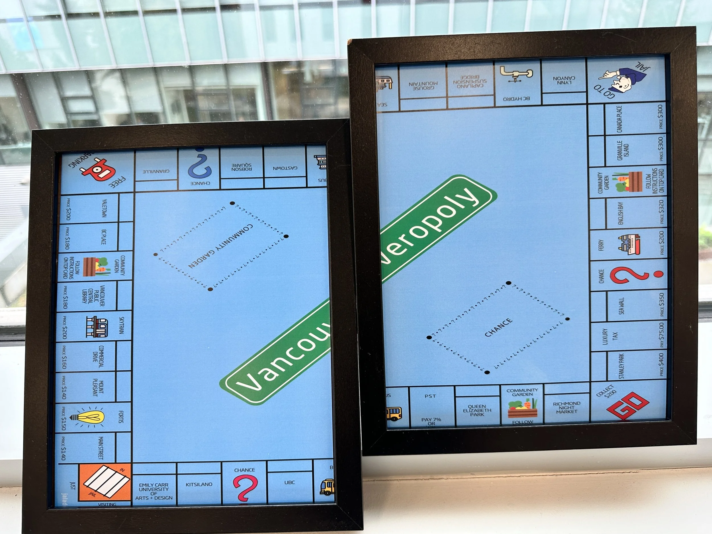
The frames I used were found at a vintage antique store. Imbued in my practice is a spirit of sustainability. I love the ideas around recycling, upcycling, sampling, collating etc., any way I can reimagine something old and put it in a new context excites me.
Final Reflections
I learned a lot through this first prompt. As I begin to establish my practice here a Emily Carr I getting better at recognizing my strengths, who I can talk to bounce ideas around and the places at the school I want to further explore. I am excited that I was able to create a gift that Deechen enjoyed and I can’t wait to see what else I make here.