prompt.2 ~ material
State of Affairs

For this prompt, we were tasked with exploring a material of our choice for two weeks. During the first week, we were told to keep open with our explorations and in the second week realize an outcome that explores the material’s capacity and that relates to the theme of origin.
I chose paper as my material because of its accessibility and ubiquity.
Keywords: iterative, child-like, share (publish), hand*,

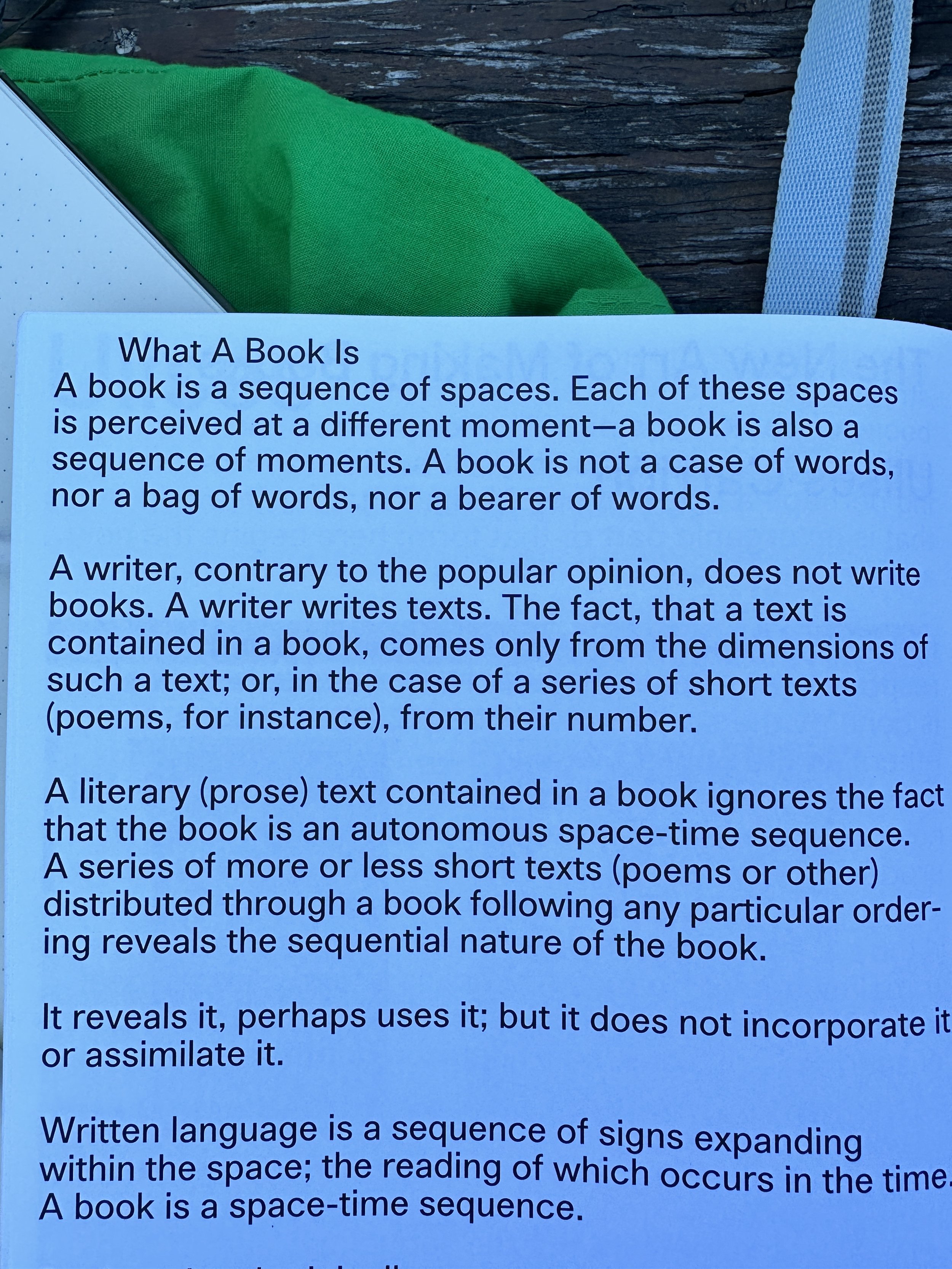
I found
this quote early on and it guided me throughout this prompt.
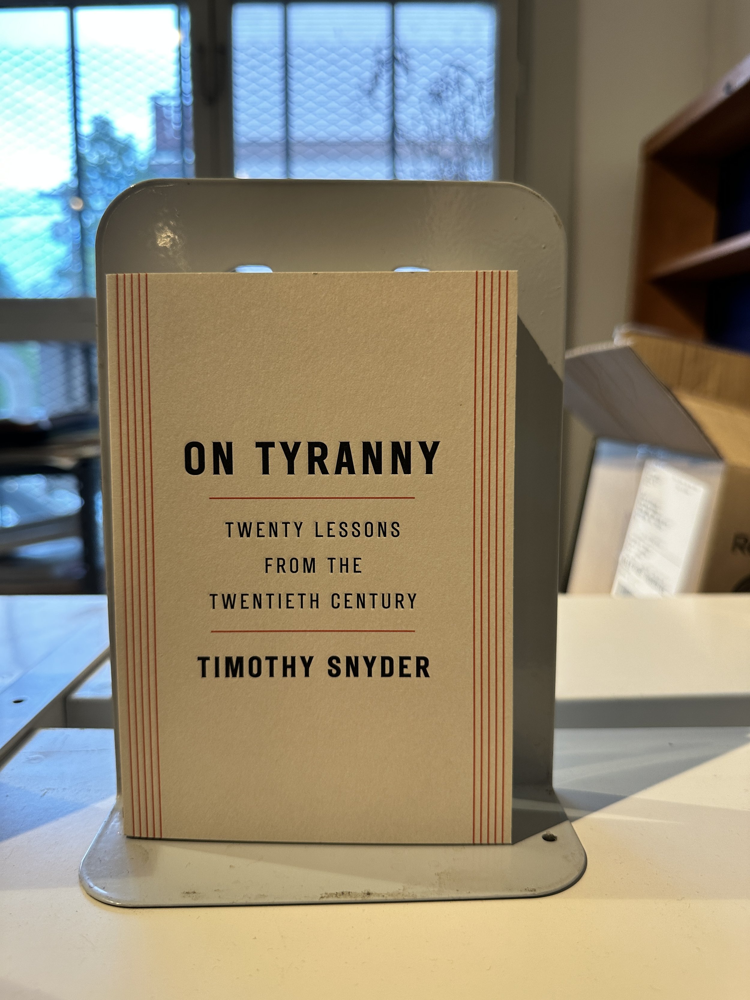
It made me remember that as I enter this new terrain, as an artist and a designer, it is my responsibility to be able to sit in a space of unknown and discomfort for a chance to make a better future (more on this book later).

My first
subject of inquiry in my paper exploration was a newspaper. I decided to make a collage.
During spring 2023 I was making a collage every weekend and I was interested in continuing that practice but now through the lens of paper.
Through this process, I appreciated collage's ability to allow me to create a new meaning with media that already exists. I see it as a form of sampling.
Through collaging, I also felt I was gaining a better understanding of how to use the digital tool equivalent.

After finishing
my newspaper collage I did some research on newspapers. To my surprise and delight, I found out that the person who pioneered using wood pulp for newspapers was a Canadian.

My second
subject was the C Magazine. C mag is a Canadian art magazine that focuses on contemporary arts and criticism.
I liked using this magazine as my second subject because it was Canadian. Throughout this prompt, while I was considering how I was to produce an outcome that relates to ‘origins’, my identity as a Canadian was the first thing that struck me as relevant.
After living in California for the last four years, I have felt disconnected from my roots. Moving back to Canada to attend Emily Carr was partly motivated by my desire to reconnect with the place I was born.
I appreciated using C Mag for this second collage because of its paperweight. The thickness of the magazine pages made it easier for me to manipulate shapes, as well as, create more structural and 3D elements in my collage.

Whilst working
on the first two collages, I stumbled upon the book ‘Publishing as Pratice’.
I’m sure I’ll say this about every book I finish but the insights I gained from reading this were monumental in understanding what my practice could be.

One of
the key insight I got from this book was a greater appreciation of books for the craft, artistry and design that goes into making them and not only the words which are written.
From here, I started to take note of books and other printed materials for their "surface value”.

As an ode
to ‘Publishing as Practice’ and Ulises Carrión for opening my mind, I wanted to make a book to memorialize my newfound appreciation of books.
I saw bookmaking as a natural progression of my paper exploration and I wanted to experiment with playing with space, shape and rhythm.

'Book' v1

Over the
weekend, I spent time collaging, zine making and exploring paper and book spaces.
I chose to work with collage again because that was the most accessible activity I could do at home.
However, instead of solely using newspapers or magazines, I chose to use scraps of paper found around my house.
I liked the idea of using scrap material because imbued in my practice is a spirit of environmentalism and earth consciousness. Even though what I am exploring does not specifically deal with the environment, good design is sustainable design.


Car Free Day
Main Street

I went
to Lucky’s which is a bookstore by my house. I participated in their “Draw a scary monster” challenge and explored their collection.

In my
exploration of their book selection I was again intrigued in seeing how books were made and the different styles, techniques and designs that were employed.

This was
a menu at a ramen restaurant and I was impressed by their minimalistic design and paper choice.

I used
the material I collected at Main Streets ‘Car Free Day’ and made a zine.

This was
the first handmade zine I’ve made and through this process, I began to feel a stronger connection to paper.

I had
a sense of child-like wonder whilst making this.
As I folded the papers and glued things together, I was transported back to a younger me; a forgotten me?

Over the
weekend, my roommate and I worked on the first Radio Emily graphic. On Monday, we scheduled a risograph appointment and here I started to recognize the benefits of my increased awareness of paper. I felt a greater sense of care when choosing and handling the paper.
We chose a white, newspaper and grey colored letter-sized paper, with the grey paper being a slightly heavier weight than the other two. Initially, we only intended to choose one type of paper, but, I noticed how the three lined up well together forming a triptych. We thought this would be an interesting display next to our booth for Clubs Day.

Monday morning
through a conversation with an industrial design student, I learned about Emily Carr’s artist book collection.
The collection was very inspirational. Going through the material, I gained a better context of what a book could be.


Iteration is
a key element of my personal design language. Before my 1 on 1 with my studio professor Cameron, I wanted to do another version of “Book”. Although I liked my first book, there were a lot of elements that I thought could be improved.
I initially imagined the book’s form to be tiny. I wanted to call it “Book” in irony and as a direct reaction and response to Ulises Carrión essay. Because so much of what he talked about in his essay “The New Art of Making Books” devalued words being the most important part of the book, I wanted to make a book that consisted of primarily empty pages, with only a few pages having a quote from Carrión’s essay.
In the first version, I underestimated how small I could make my handwriting and didn’t preplan how I wanted the text to look on the paper. In this second version, the first thing I did was plan out how I wanted the text to fit on the page and then formed the book around that.
I really liked the idea of using the word ‘Book’ as the title but having it come from the text itself; almost like a peephole.
For the first version, I ran into technical difficulties as there was no good way to cut through multiple pages except by way of a hole-puncher. For the second version, I realized that I only needed to cut the amount of pages deep that I wanted the quote to appear. Even though I still had to use this relatively cumbersome method, I was impressed I could come to that realization that made the process of making this second book faster. In comparison, I completed the first book over the course of two days while the second book took me only a few hours.
If I were to do a third version of this book or any book I make in general, I would want to put more intention into the way I bind and curate the contents of the book. For the binding aspect of things, the method I used for both books is flimsy. I also wrote the quote too close to the margins which makes it harder to read.
For the curation of the contents, I liked the idea of using scrap paper from the communication design studio but besides thinking about the front and back cover, I didn’t have as much intention about how I wanted the pages on the inside to flow.

My meeting
with Cameron gave me a lot of food for thought for the direction of the final outcome of the project.
A few comments that stuck out were an increased focus on craft, curation and rhythm. He also encouraged me to think about a zine’s purpose in culture and how they are meant to be shared.
Funny enough, although I am a designer in many senses, up until this point, it felt that the majority of the projects I worked on were for myself. This is not to say that I never do things for others but up until this point, I wasn’t as conscious about it.

After taking
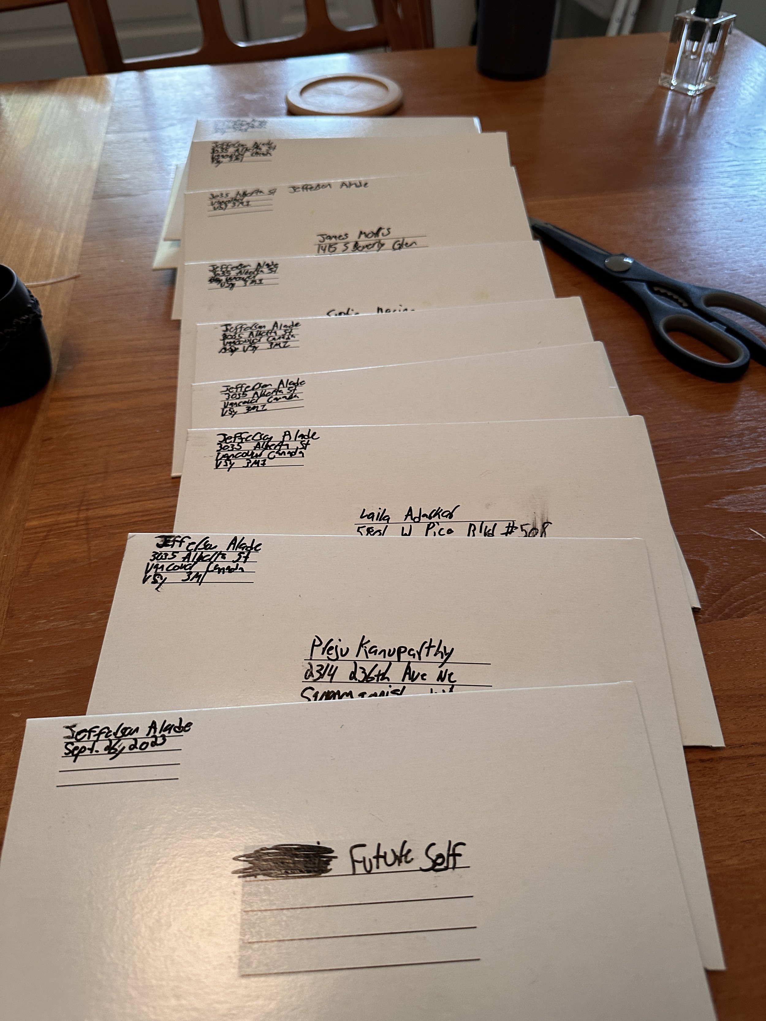
some time to ponder I realized that the final outcome for this prompt would be a zine. However, to really put myself in the space of sharing I thought the only way to complete this project was to actually send these zines to people.
I recently graduated from my undergrad at UCLA and I have been missing my friends and community. I decided to send these zines to them. I thought this idea was the perfect opportunity to stay connected with them in a meaningful way that felt more significant than a text or an Instagram post.
I thought this also tied in perfectly with the outcome of the prompt to connect to ‘origin’. By sending a zine with content like a status update, I was showing my friends my origins.
I made these test zines as a way to better conceptualize how the digital looked in the printed form.

Flat Stanley
was the topic of this zine and ‘State of Affairs’ is the collection’s name. The topic of the zine was inspired by a conversation I had with friends before I left. We were reminiscing about the last four years and were coming to the realization that we wouldn’t be able to have instant access to friends that we once had.
One of the girls mentioned she wished that her friends could be like Flat Stanley and could easily travel with her. This resonated with me and I initially planned to use these feeling of loss, nostalgia and gratefulness in a song. But, for some reason, when I tried to make the song the idea wasn’t coming out as I wanted it to.
However, with this direction of making a zine for prompt 2, I realized that this was the better form for that idea.
For the making of this zine, I found an image of Flat Stanely and from the suggestion of my roommate, I illustrated a few personal details that my friends may recognize as mainstays in my outfits.
In the form of an Xbook, I thought to continue to play on the idea of Flat Stanely and decided to “hide” the image of him on the inside so you had to unfold it to see him.

The name
of the collection is ‘State of Affairs vol.2: Flat Stanley’. The reason why it is vol.2 and not vol.1 stems from another point of inspiration I got from ‘Publishing as Practice’. In one of the essays in the book they talk about this iconic magazine in the late 60s called ‘Aspen’. Aspen was multimedia. It was formless, genre-bending and a publication that produced magazine issues that were non-continuous. An edition could be a booklet, a poster, or a film; it could arrive in a shoebox or a customized folder. Each edition could be completely different from the last. They pushed what a magazine could be, maybe too far. They eventually lost privileges which granted magazines cheaper mailing rates because the postal service couldn’t see them in the classic moulds that magazines usually have. Shortly after, they couldn’t afford to mail them out.
6 months ago, I posted a photo dump on my Instagram of recent highlights of my life and called it ‘State of Affairs: vol. 1: I am a palm tree’.I thought why not use this opportunity to defy traditional linear approaches to content and continue the idea in this form of a zine.
I used the risograph for the Flat Stanley image and the stickers. I like making stickers and I thought it would be a good touch to put them on the back of the mailers. Putting a sticker on the mailer not only added a seal of protection, it also continued the idea and branding of my zine onto the mailer.

I printed
the zine itself on tabloid-sized paper. I took this chance to fill the zine with a poem (the lyrics I was going to use for the attempted song), my favourite images from Vancouver so far as well as song and album recommendations.
I took a lot of time to focus on the rhythm of the zine, taking extra care that the text and images would flow well with each other and the reader would leave with a positive experience in handling it.
I used QR codes as a way to connect the physical to the digital. My friends use Apple Music and Spotify so I included both codes and colour-coded them respectively based on each brand's recognizable style. As the final ode to my Canadian origins, I decided to use newsprint as the cover page of the zine and risograph an image of Stanley Park on the back.


It was
a push to get these done before class and I stayed up almost all night gluing, cutting and packaging the zines. I was able to have everything ready for class and then mail them out after.

The process
of exploring paper generally to narrowing it down to a zine was an exciting and gratifying process. Through making, I realized that when more intention is directed to sharing work, you naturally see and interpret the needs of the project differently. This mindset shift has progressed my practice as a designer and pushes me one step closer to my thesis.
I plan on continuing to make books as well as explore different channels to connect with people in a meaningful way.

Updates:
So far 7 of the 12 people have received my package. Everyone has sounded very appreciative of this medium of connection with 2 recipients eager to continue a dialogue through snail mail.

